Squares are the obvious grid. Uber rejected them.
Look at one square's neighbours:
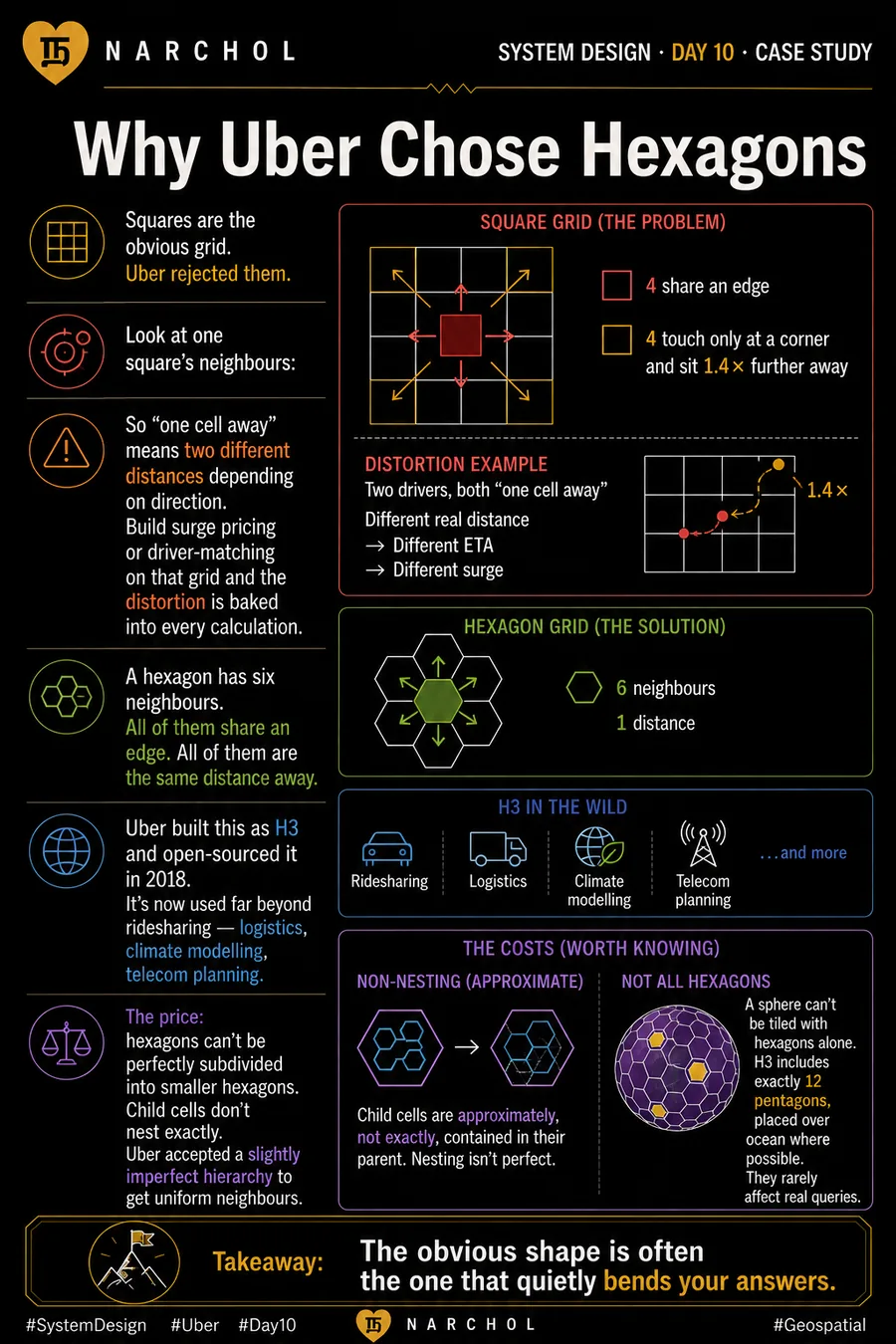
On a square grid, a cell has eight neighbours but only four share an edge. The other four touch at a corner only, and sit about 1.4× further away. On a hexagonal grid, every cell has exactly six neighbours, all at the same distance.
So "one cell away" means two different distances depending on direction. Build surge pricing or driver-matching on that grid and the distortion is baked into every calculation.
A hexagon has six neighbours. All of them share an edge. All of them are the same distance away.
Uber built this as H3 and open-sourced it in 2018. It's now used far beyond ridesharing — logistics, climate modelling, telecom planning.
The price: hexagons can't be perfectly subdivided into smaller hexagons. Child cells don't nest exactly. Uber accepted a slightly imperfect hierarchy to get uniform neighbours.